

Bright Rebranding
The Goal
Launch a design system that communicates cohesively through the different steps of Bright’s customer journey.
Role
Lead Designer, UX Researcher, Strategist
Sector
Solar Energy
The ChallengE
Create and launch Bright’s rebranding to improve conversions at all stages of the sales funnel, increase visibility online and decrease negative customer expectations.
The Solution
Brand identity, customer portal, ambassador portal, website, imagery for customer enjoyment and sales, social media strategy and launch strategy and contract.

The project began with an internal employee survey that served to understand how the company was perceived by its employees and demonstrate if the brand was cohesive. Originally some of the stakeholders did not believe in this project and the survey was used to prove why building a cohesive brand was top priority. The results from the survey led the team to unanimously approve the project and form an executive stakeholder team to help take decisions on the new brand’s direction.
An external survey sent to more than 500 clients provided information of what the clients thought about Bright and their experience with the company.


Through a series of brainstorms sessions with the team, we looked at color revisions, analyzed typography, and tested copy with imagery. These sessions implemented co-design and led us to land on three potential directions that considered Bright’s brand essence and incorporated a vision of growth and expansion.

Team brainstorm session where we clustered imagery based on color, style and message.
The logo represents a sun peeking through a solar panel in a modern and clean aesthetic. The sun is peeking from the left to represent growth and expansion for Bright.

The new color scheme represents the sun, the energy and the future of using renewables.


Once the brand was complete we created a launch strategy to ensure that all the materials would be in brand before the customer interacted with them. There where changes made to the contract, customer enjoyment and sales support material, internal operations platform, sales platform, website, ads and more.

Contract
Bright’s main product includes a 13 year contract for the client. The contract had to be self explanatory and inspire confidence in order for the client to want to sign it. This issue was resolved by designing a non-conventional contract that used a contract cover that explained how much the client would be paying in the thirteen year period as well as the main benefits of the product, allowing the client to easily understand the product and know that it could trust Bright.
Customer Enjoyment & Sales support material
Images where created in order for the customer enjoyment team and the sales team to be able to take the client through a smooth process. Since the product has a very technical aspect to it, that team had to be able to explain with images and steps how to easily fix or address any of their upcoming doubts. More than 15 images where created.
Internal Operations Site & App
New design implemented to both the internal operations site and the app. This was the first soft launch to get the whole company excited on the new change that was about to come.
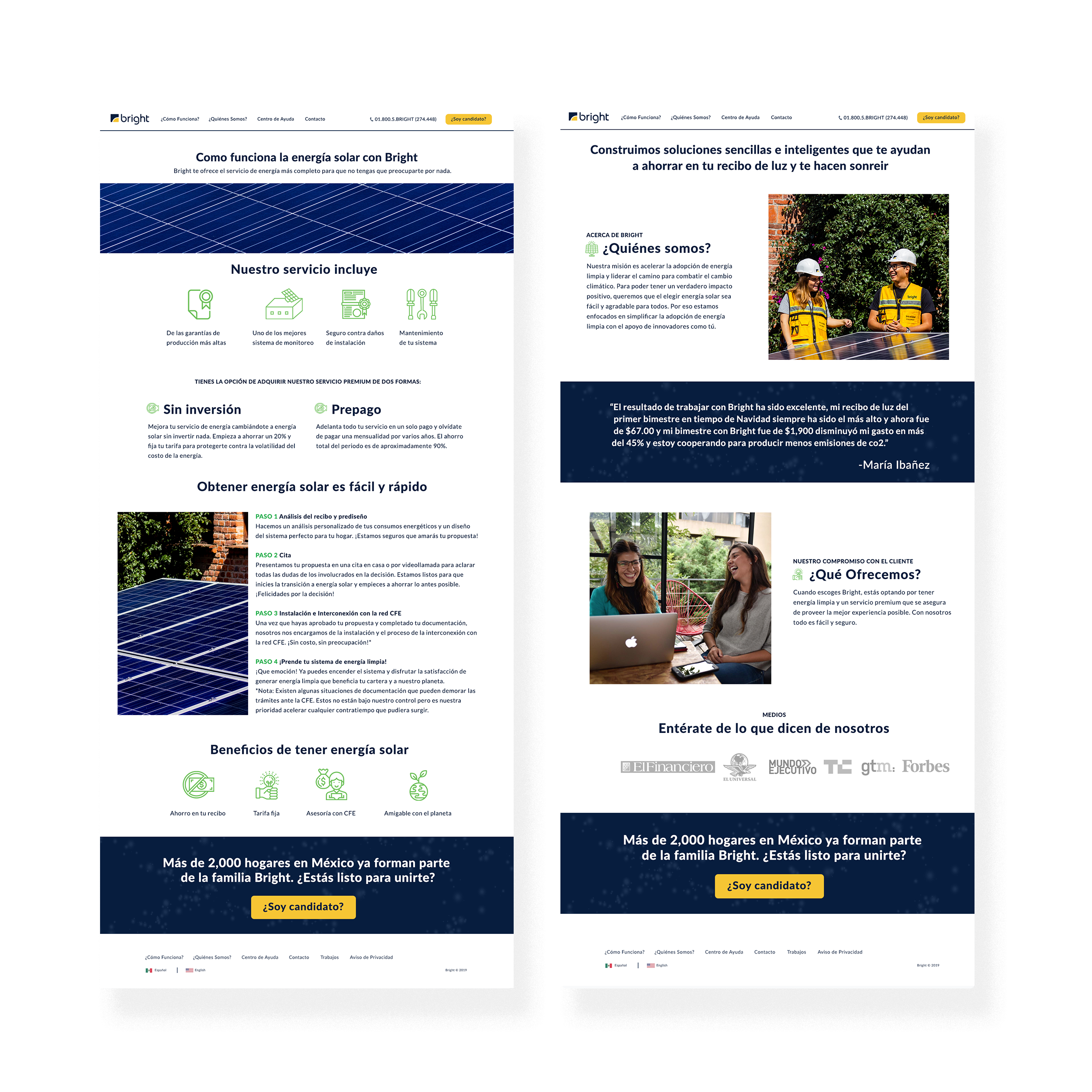
Website
The new design of the website was made to fit the old structure but provide a new and better look for the user. It was meant to increase navigation and provide direct information to the user about how the product worked. You can find further information on Bright at https://www.thinkbright.mx

Social media campaign
Create and strategy to launch brand awareness campaign. To inform the current clients about the change in brand and promote the new brand look for new potential clients. Content was produced for facebook ads, google ads and newsletter campaign.

Learning
Hard work and perseverance lead to unthinkable results, never give up on wanting to make a design system better eventually the opportunity will come along.
Results
Bright has a new cohesive brand with a clear communication system. The new brand improved on its communication and system to present itself in a newer brighter way to their customers and new potential customers.